- Marketing Websites
- Layout
Hyperlinks – Anchor vs. Button Tags

This post is part of a series
The Must-Know Benefits of CMS for Your Company
null
What is a content management system (CMS)?
5′ reading timePersona x CMS
11′ reading timeHow Structured Content Benefits Marketing and Product Teams
8′ reading timeHow to Own the Data of Your Research Repository – and Why It Matters
4′ reading timeHyperlinks – Anchor vs. Button Tags (currently reading)
6′ reading timeThe Difference Between a Website, Homepage and a Weblog
4′ reading time
Calls to action on marketing websites often feature a prominent element that looks like a button. A colorful surface and bold typography, crafted to invite a click. These visual elements feature engaging micro-interactions like subtle hover animations and effects that make the experience feel rewarding.
As the name suggests, they are designed to capture attention and make users take action.
Buttons May Not Be What You Want Link to this headline
As a designer or website owner this might not be what you want though. We’ll look into a couple of reasons why elements that look like buttons are often a poor choice.
Key Takeaway
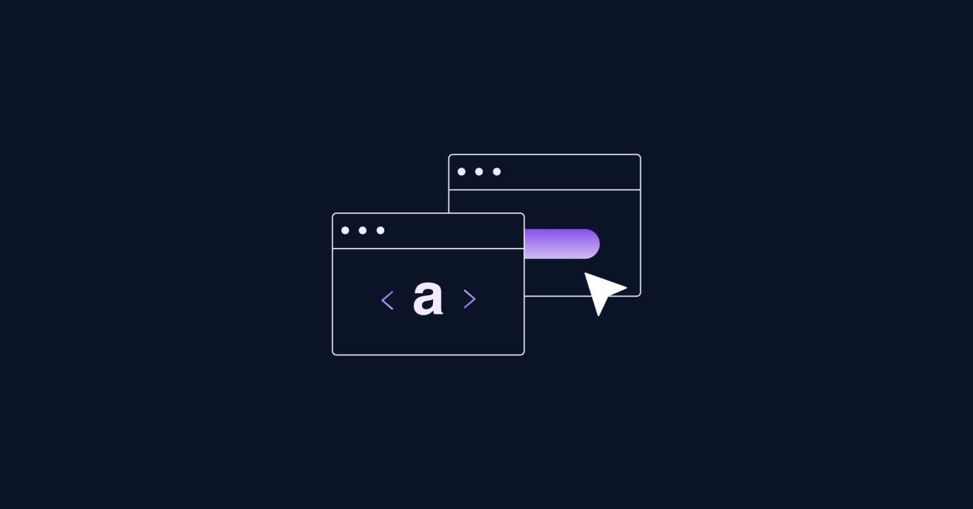
Buttons are often used as links, but technically, buttons and links have distinct features and function differently. Styling a link to look like a button can harm accessibility, creating a confusing experience that may make users hesitant to click at all.
Buttons should be used whenever the interaction changes the document state, i.e. persist data to a database, open a dialog or modal.
Links should be used for navigation on the same page, to other pages or external resources, like downloads.
Especially on marketing websites calls to action (CTAs) are often buttons in disguise only. Their functionality is that of a link. Technically they in fact are defined as links with styling added to make them look like a button.
Technical Differences Between a Button and a Link Link to this headline
In some cases buttons (HTML button element <button>) and links (HTML anchor element <a>) seem to have the same purpose: pressing them makes the browser load another page. You receive visual feedback that the browser is loading new content, e.g. by a little spinner in the tab. Once the loading is done, the viewport shows different content.
Behind the scenes the way data is exchanged between browser and server differs depending on whether a button element or anchor tag is used. Using an anchor tag in a simple HTML form will result in the browser navigating away from the form without sending any data. Using a button outside of a form will result in nothing happening.
<form action="/results/">
  <label>
    <input type="radio" name="poll" value="pizza" />
    Pizza
  </label>
  <label>
    <input type="radio" name="poll" value="ramen" />
    Ramen
  </label>

  <!-- will not send any data to the server -->
  <a href="/results/">Show results</a>
</form>

<!-- will not do anything -->
<button>Show results</button>
While forms are the most obvious example for different functionalities between buttons and links, buttons have multiple additional use cases. Buttons can be used to modify state in place, for example toggling a popover (HTML-only functionality for buttons is rare, the popover functionality became available in all major browsers only recently).
<p>
  CTA
  <button popovertarget="definition">Look up</button>
</p>

<div popover id="definition">CTA: Call to Action</div>
Affordance and Accessibility Link to this headline
The different use cases of buttons and links mean that they behave in slightly different ways, too. When using keyboard navigation a focused button can be triggered with spacebar or return key. Navigation to the target URL of an anchor tag however is triggered only by hitting the return key. This makes keyboard navigation with anchor tags that look like buttons confusing and sometimes annoying: the spacebar scrolls one viewport height down when no element is focused or the focused element is not a button.
Assistive technology will announce a button in a different way and might give additional contextual information, e.g. button Show results, press Space to activate
.
User Experience Link to this headline
Users know about the differences between buttons and links, even if only subconsciously. In a recent usability test , we explored how users interact with prominent button-like calls to action on marketing pages, especially those positioned above the fold.
Our goal was to understand if these CTA s were effectively engaging users to click.
Observations Link to this headline
The study revealed the majority of users was hesitant to press a prominent buttons at the top of the page, especially when they were styled as primary CTAs. Although specifically designed to attract clicks and worded in a way that supported the primary user journey, users ignored and scrolled past them.
Insights Link to this headline
Through follow-up interviews, we uncovered that this hesitation stemmed from a learned expectation: prominent buttons frequently take users away from the content they are currently viewing. This involuntary context switch is seen as invasive and in most cases does not offer an obvious way to recover. Especially during the information-gathering phase, early in the customer journey, users prefer to stay within the current context without feeling pushed. For users in this learning phase,
buttons that appeared overly directive (like Buy Now
or Get Started
) were seen as premature and distracting. This highlights that landing pages, usually at the top of the funnel, benefit from a less aggressive approach—allowing users to explore the content at their own pace before encountering CTAs, rather than pushing for immediate decisions.
When to Use Buttons vs. Links Link to this headline
To help make the right choice between buttons and links, here are some simple Do’s and Don’ts.
These can ensure you that your design is both intuitive and accessible for users, making navigation smoother and interactions more meaningful.
Do's Link to this headline
- Use Buttons for actions within the page, like submitting a form, toggling content, or opening a modal.
- Use Links for navigation, guiding users to other pages, sections, or external resources.
- Ensure Accessibility by using common visual cues for each element. A button should look like a button, and a link should look like a link. This helps users understand the expected interaction at a glance.
Don'ts Link to this headline
- Don’t Style Links to Look Like Buttons, as it can create confusion and disrupt accessibility for users, especially those using assistive technology.
- Avoid Buttons for Navigation to different pages or sections. Buttons are designed for actions that change document state—using them for navigation can disorient users.
- Don’t Overuse button-styled elements. Too many prominent CTAs can overwhelm users and reduce the impact of your primary call to action.
Takeaways Link to this headline
Designers and website owners can use these findings to improve the user experience on marketing pages by:
- Avoiding overly prominent CTA s at the top of the page for users in an exploratory phase.
- Providing descriptive options instead that (like
Learn more
) to allow users to enter their preferred user journey and proceed at their own pace. - Ensuring that buttons and links match the intent and expectations of users, this will reduce unintended interactions and improve the user experience through well-known affordances.


