
The UX of Nostalgia: Why Retro Interfaces Feel Good Link to this headline
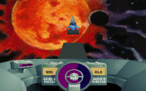
In first grade we had computer lessons. Thirty of us would storm into the lab — an air-conditioned, red-carpeted, light-humming room. It was my favourite lesson. We’d clack away at our cream-white computers, playing Skyroads , Microsoft Minesweeper , and Chess .
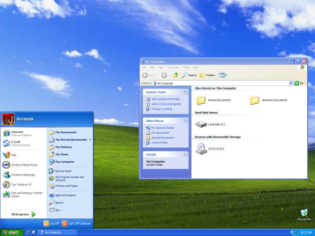
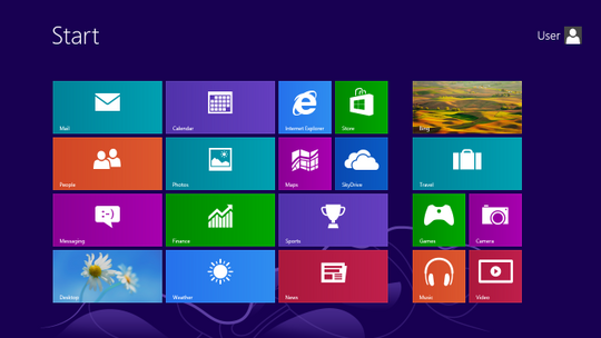
As life continued, we flowed through different operating systems: from Windows 95, to my beloved XP, and finally to the traitorous Windows 8. If it wasn’t for Windows 8, we might still be stuck with glossy, flat, purple interfaces.
Retro interfaces felt tangible, hard, real, and somewhat analogue. The colours were vivid and bright. The affordance was clear. The processes demanded presence and caution. (I still have nightmares about unsaved Word documents.) Somehow these elements have been replaced — and are sorely missed.
But why does nostalgia hit us so strongly when we encounter these old designs? Why do screenshots of pixelated icons or skeuomorphic notepads on Twitter spark joy and longing? The answer lies in psychology. Nostalgia itself is a powerful emotion, often described as bittersweet but mostly positive. Research shows it helps us cope with uncertainty by reminding us of identity, comfort and belonging. When these feelings are triggered by design, we feel safe. We feel connected. And that makes us more receptive to what’s in front of us. In fact, a 2025 survey found that 75% of consumers are more likely to purchase something if it’s presented with nostalgic cues. That’s not a coincidence, nostalgia lowers resistance and builds trust.
This also explains why interfaces we once found frustrating suddenly feel endearing in hindsight. Studies in user psychology point to the “aesthetic–usability effect,” the idea that if something looks appealing, we judge it to be easier to use, even if it’s not. Retro UIs — with their bright colors, clear edges, and literal icons like floppy disks for saving — carry that aura of usability. They may not have been faster or more efficient, but they felt clear. And feelings matter. One study on older adults found that when new digital devices were designed with nostalgic features, like radio dials or skeuomorphic buttons, people were less intimidated and more willing to try them. The design reduced their anxiety because it looked familiar and evoked past experiences.
There’s also the simple matter of memory. Recognition is easier than recall — we’re better at recognizing a floppy disk icon than remembering where to find “save” hidden in a modern drop-down menu. Retro designs leaned heavily on recognition, using physical metaphors that made interfaces intuitive for beginners. This is partly why so many of us still love pixel fonts, chunky buttons, and even loading screens. They carried weight and morphed aspects of the physical world into the digital world. Unlike today’s instant fades and infinite scrolls which , while efficient, leave little emotional residue and tangibility.
Feature of Retro Designs Link to this headline
3D buttons Link to this headline
One of the most striking features of retro design was the chunky 3D button. These weren’t the flat ghost buttons of modern mobile apps. They had shadows, edges, and depth. When you pressed them, they looked pressed. That tactile feedback mattered. You didn’t wonder if your click registered; you saw and felt it on screen. Modern UX talks about affordance — the idea that you can tell what something does just by looking at it. Retro buttons embodied affordance at its clearest.
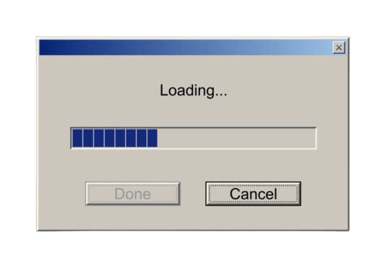
Loading Bars & Splash Screens Link to this headline
Then there were the loading bars and splash screens. Today, we complain about waiting, but there was something strangely comforting about that slow, creeping progress bar. It gave weight to digital tasks. You were saving a file, burning a CD, or installing a game, and the wait made the action feel important. Designers now talk about “perceived progress,” but the old progress bars turned waiting into a ritual, not an irritation.
Icons and fonts Link to this headline
Retro design also embraced pixelated icons and bitmap fonts. The floppy disk “save” icon is still alive decades after the floppy died. These tiny visuals weren’t just placeholders — they were metaphors that linked digital actions to the physical world. A trash bin really looked like a bin. A notepad looked like a yellow-lined pad. Skeuomorphism, though often mocked, gave clarity. When you were ten years old in a computer lab, you didn’t need a tutorial. You saw the icon and you just knew.
Cursors Link to this headline
And maybe the most charming element of all: cursors with personality. Early websites let you swap the default arrow for sparkles, hands, or even animated GIF pointers. Silly? Absolutely. But they made interaction feel playful and human. Today’s UX is efficient, but it rarely winks back at you.
Lessons for Modern UX Link to this headline
Nostalgia doesn’t mean dragging old design back wholesale. It means asking: what worked emotionally back then, and how can we bring that warmth into today’s sleek systems?
- Bring back tactility: buttons, toggles, and switches that feel real and pressed.
- Reintroduce delight: playful cursors, subtle animations, Easter eggs that surprise and amuse.
- Use clear metaphors: icons that actually look like what they represent.
- Embrace moments of presence: not everything has to be instant. Sometimes waiting, with a clear and meaningful indicator, adds value.
- Keep nostalgia optional: offer retro “modes” or themes, so users can opt into the charm without losing efficiency.
Examples of Nostalgic Websites Link to this headline
Nic Chan Portfolio Link to this headline
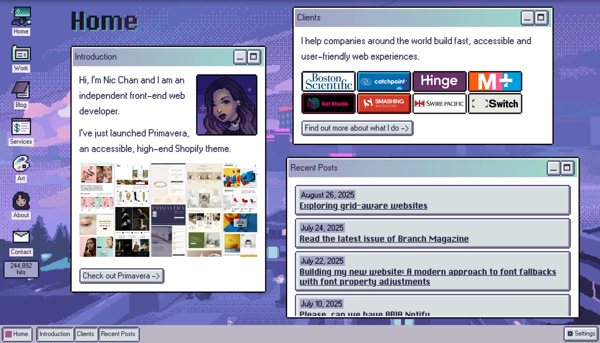
The site uses a purple retro-styled Windows design aesthetic. The layout is broken into “windows” you can minimize and maximize. In her blog post “Building my new website: light-dark and blog posts” she describes how the author used color variables, pixel-style borders, and referencing Windows 95 UI as inspiration.
Why it's so cool? Link to this headline
The retro aesthetic isn’t just surface-level decoration — it shapes the entire structure of the site. You really feel like you’re navigating an old-school operating system. At the same time, thoughtful touches like light/dark themes and accessibility features ensure that usability remains modern and smooth. It proves nostalgia can be playful without sacrificing clarity or function.
Lofree Mechanical Keyboards Link to this headline
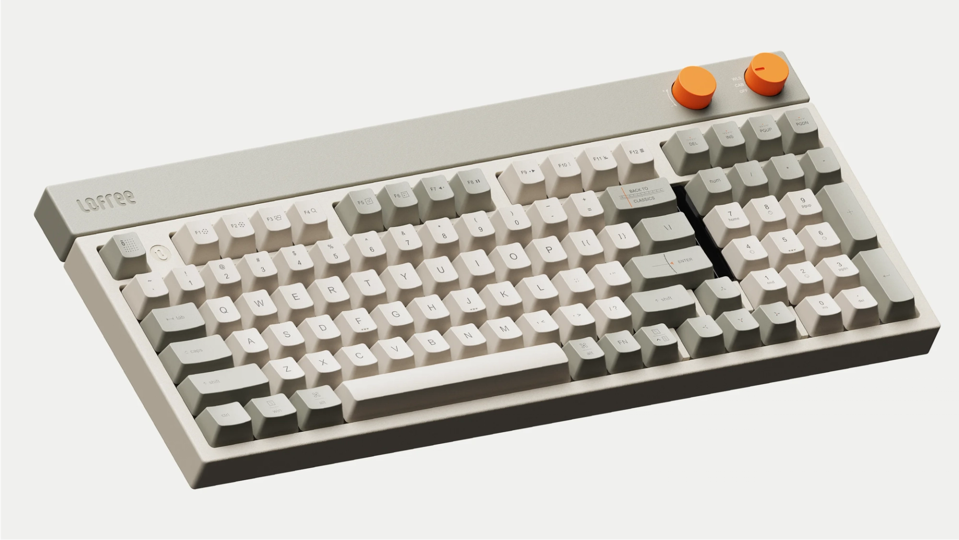
https://www.lofree.co/products/lofree-block-wireless-mechanical-keyboard-1
Retro is baked right into this product. The keyboard looks like something straight out of the 90s — sturdy, tactile, and unapologetically physical. It echoes everything people loved about older tech: the sense of weight, durability, and instant feedback from every press.
Why it’s so cool? Link to this headline
The design doesn’t just look retro, it feels retro. The inclusion of analog-style knobs is genius — knobs have always signaled control, adjustability, and presence, whether on pinball machines, vintage radios, or hi-fi stereos. The tiny display for connection modes nods to the old LED screens we grew up with. It’s a perfect blend of nostalgia and function, taking cues from the past while delivering a modern product.
Conclusion Link to this headline
Retro design is more than a visual throwback, it’s an emotional shortcut. When we see chunky 3D buttons, pixelated icons, or skeuomorphic notepads, we’re not just looking at design choices, we’re reconnecting with memories of our first digital encounters with technology.
What makes nostalgia so powerful in UX is its ability to blend familiarity with delight. It lowers barriers, sparks comfort, and even makes us more forgiving of flaws.
As designers, the lesson isn’t to drag users back into the 90s or force skeuomorphism on every app. The real opportunity is to borrow the best of the past — the clarity, tangibility and joy. Then remix it with modern accessibility, responsiveness, and performance. Nostalgia works when it adds warmth to an otherwise sterile experience, when it makes technology feel human again.
Because in the end, what we miss about retro interfaces isn’t just the look. It’s the presence. The sense that every action mattered. And if today’s interfaces can learn to balance seamless efficiency with that same emotional weight, we won’t just use them, we’ll remember them.


'/%3e%3cpath%20d='M62.0348%20162.889L123.416%20162.889'%20stroke='white'%20stroke-width='4.76'%20stroke-linecap='round'%20stroke-linejoin='round'/%3e%3cpath%20d='M62.0348%20170.889L123.416%20170.889'%20stroke='white'%20stroke-width='4.76'%20stroke-linecap='round'%20stroke-linejoin='round'/%3e%3cpath%20d='M62.0348%20178.889L123.416%20178.889'%20stroke='white'%20stroke-width='4.76'%20stroke-linecap='round'%20stroke-linejoin='round'/%3e%3cdefs%3e%3clinearGradient%20id='paint0_linear_3690_24257'%20x1='93.4124'%20y1='10'%20x2='93.4124'%20y2='156.912'%20gradientUnits='userSpaceOnUse'%3e%3cstop%20stop-color='%2369FD90'/%3e%3cstop%20offset='1'%20stop-color='%23DFFAED'/%3e%3c/linearGradient%3e%3c/defs%3e%3c/svg%3e)
'%3e%3ccircle%20cx='93.2117'%20cy='93.2115'%20r='79.373'%20fill='white'/%3e%3ccircle%20cx='92.9737'%20cy='93.2115'%20r='60.571'%20fill='%230B1329'/%3e%3cmask%20id='path-3-inside-1_3690_24255'%20fill='white'%3e%3cpath%20d='M93.2117%20172.584C73.9198%20172.584%2055.2883%20165.558%2040.8004%20152.82C26.3125%20140.081%2016.9599%20122.502%2014.4913%20103.368C12.0226%2084.2351%2016.6068%2064.8577%2027.3869%2048.8588C38.1669%2032.8598%2054.4049%2021.3347%2073.0649%2016.4379L77.9002%2034.8636C63.7185%2038.5851%2051.3777%2047.3442%2043.1848%2059.5034C34.992%2071.6626%2031.508%2086.3895%2033.3842%20100.931C35.2603%20115.472%2042.3683%20128.832%2053.3791%20138.514C64.39%20148.195%2078.5499%20153.535%2093.2117%20153.535L93.2117%20172.584Z'/%3e%3c/mask%3e%3cpath%20d='M93.2117%20172.584C73.9198%20172.584%2055.2883%20165.558%2040.8004%20152.82C26.3125%20140.081%2016.9599%20122.502%2014.4913%20103.368C12.0226%2084.2351%2016.6068%2064.8577%2027.3869%2048.8588C38.1669%2032.8598%2054.4049%2021.3347%2073.0649%2016.4379L77.9002%2034.8636C63.7185%2038.5851%2051.3777%2047.3442%2043.1848%2059.5034C34.992%2071.6626%2031.508%2086.3895%2033.3842%20100.931C35.2603%20115.472%2042.3683%20128.832%2053.3791%20138.514C64.39%20148.195%2078.5499%20153.535%2093.2117%20153.535L93.2117%20172.584Z'%20fill='%230B1329'%20stroke='white'%20stroke-width='9.52'%20mask='url(%23path-3-inside-1_3690_24255)'/%3e%3cmask%20id='path-4-inside-2_3690_24255'%20fill='white'%3e%3cpath%20d='M72.6684%2016.5432C83.5818%2013.619%2094.9937%2013.0584%20106.141%2014.8988C117.289%2016.7393%20127.915%2020.9384%20137.309%2027.2154C146.703%2033.4925%20154.649%2041.7027%20160.615%2051.2973C166.582%2060.8919%20170.431%2071.6497%20171.906%2082.8514C173.38%2094.0531%20172.447%20105.441%20169.167%20116.252C165.887%20127.064%20160.337%20137.051%20152.887%20145.546C145.438%20154.04%20136.261%20160.847%20125.969%20165.51C115.678%20170.173%20104.51%20172.585%2093.2117%20172.585L93.2117%20153.535C101.798%20153.535%20110.286%20151.702%20118.108%20148.158C125.929%20144.614%20132.904%20139.442%20138.565%20132.986C144.227%20126.53%20148.445%20118.94%20150.938%20110.723C153.43%20102.506%20154.14%2093.8512%20153.019%2085.3379C151.898%2076.8246%20148.973%2068.6487%20144.439%2061.3568C139.904%2054.0649%20133.865%2047.8251%20126.726%2043.0545C119.586%2038.284%20111.51%2035.0926%20103.038%2033.6939C94.566%2032.2952%2085.893%2032.7213%2077.5988%2034.9437L72.6684%2016.5432Z'/%3e%3c/mask%3e%3cpath%20d='M72.6684%2016.5432C83.5818%2013.619%2094.9937%2013.0584%20106.141%2014.8988C117.289%2016.7393%20127.915%2020.9384%20137.309%2027.2154C146.703%2033.4925%20154.649%2041.7027%20160.615%2051.2973C166.582%2060.8919%20170.431%2071.6497%20171.906%2082.8514C173.38%2094.0531%20172.447%20105.441%20169.167%20116.252C165.887%20127.064%20160.337%20137.051%20152.887%20145.546C145.438%20154.04%20136.261%20160.847%20125.969%20165.51C115.678%20170.173%20104.51%20172.585%2093.2117%20172.585L93.2117%20153.535C101.798%20153.535%20110.286%20151.702%20118.108%20148.158C125.929%20144.614%20132.904%20139.442%20138.565%20132.986C144.227%20126.53%20148.445%20118.94%20150.938%20110.723C153.43%20102.506%20154.14%2093.8512%20153.019%2085.3379C151.898%2076.8246%20148.973%2068.6487%20144.439%2061.3568C139.904%2054.0649%20133.865%2047.8251%20126.726%2043.0545C119.586%2038.284%20111.51%2035.0926%20103.038%2033.6939C94.566%2032.2952%2085.893%2032.7213%2077.5988%2034.9437L72.6684%2016.5432Z'%20fill='white'%20stroke='white'%20stroke-width='3.332'%20mask='url(%23path-4-inside-2_3690_24255)'/%3e%3cpath%20d='M93.6151%20114.251C99.6127%20114.251%20103.326%20111.466%20105.753%20107.039L108.966%20109.181C105.825%20114.893%20101.469%20118.106%2093.6151%20118.106C84.0475%20118.106%2077.4073%20111.609%2075.6223%2099.3281H71.2669V96.1151H75.2653C75.1939%2094.9013%2075.1225%2093.6875%2075.1225%2092.4023C75.1225%2091.1171%2075.1939%2089.9033%2075.2653%2088.6895H71.2669V85.4765H75.6223C77.3359%2073.1957%2084.0475%2066.6983%2093.6151%2066.6983C101.184%2066.6983%20105.825%2069.9827%20108.966%2075.4805L105.682%2077.6939C103.326%2073.4813%2099.3271%2070.5539%2093.6151%2070.5539C86.3323%2070.5539%2081.1201%2075.4805%2079.7635%2085.4765H97.3993L96.6853%2088.6895H79.4779C79.4065%2089.4749%2079.4065%2090.2603%2079.4065%2091.1171V93.6875C79.4065%2094.5443%2079.4065%2095.3297%2079.4779%2096.1151H95.0431L94.3291%2099.3281H79.7635C81.1201%20109.253%2086.3323%20114.251%2093.6151%20114.251Z'%20fill='white'/%3e%3c/g%3e%3cdefs%3e%3cclipPath%20id='clip0_3690_24255'%3e%3crect%20width='185'%20height='185'%20fill='white'/%3e%3c/clipPath%3e%3c/defs%3e%3c/svg%3e)

'/%3e%3cpath%20d='M93.0126%2099.9539C96.8448%2099.9539%2099.9515%2096.8472%2099.9515%2093.015C99.9515%2089.1827%2096.8448%2086.076%2093.0126%2086.076C89.1803%2086.076%2086.0737%2089.1827%2086.0737%2093.015C86.0737%2096.8472%2089.1803%2099.9539%2093.0126%2099.9539Z'%20fill='%230B1329'/%3e%3cpath%20d='M59.0911%2099.9539C62.9234%2099.9539%2066.03%2096.8472%2066.03%2093.015C66.03%2089.1827%2062.9234%2086.076%2059.0911%2086.076C55.2589%2086.076%2052.1522%2089.1827%2052.1522%2093.015C52.1522%2096.8472%2055.2589%2099.9539%2059.0911%2099.9539Z'%20fill='%230B1329'/%3e%3cpath%20d='M126.939%2099.9539C130.771%2099.9539%20133.878%2096.8472%20133.878%2093.015C133.878%2089.1827%20130.771%2086.076%20126.939%2086.076C123.107%2086.076%20120%2089.1827%20120%2093.015C120%2096.8472%20123.107%2099.9539%20126.939%2099.9539Z'%20fill='%230B1329'/%3e%3cdefs%3e%3clinearGradient%20id='paint0_linear_3690_24254'%20x1='93.018'%20y1='19'%20x2='93.018'%20y2='167.03'%20gradientUnits='userSpaceOnUse'%3e%3cstop%20stop-color='%2369FD90'/%3e%3cstop%20offset='1'%20stop-color='%23DFFAED'/%3e%3c/linearGradient%3e%3c/defs%3e%3c/svg%3e)