
Why we should make Motion Accessible Link to this headline
Picture this: You click on a website link, ready to read an article when a pop-up suddenly appears demanding your email. To top it off, another notification banner slides in, then vanishes before you can read it and an auto-playing video loops endlessly. For many users this is more than just annoying. It’s physically sickening.
It’s that disoriented feeling after an intense rollercoaster ride that some users experience with aggressive UI animations, except they can't get off the ride. Unlike a theme park, users don't choose to experience motion sickness from your interface.
Motion sickness occurs when there is a mismatch between your senses and what your body actually expects. If your vision does not align with the the signals of your inner ear — your built-in balance and direction guide — it can leave people feeling dizzy and nauseous. While excessive motion can affect anyone, certain conditions can make users particularly vulnerable:
- Vestibular disorders affect inner ear balance system and can make even subtle animations feel nauseating.
- Chronic migraines create heightened sensitivity to visual stimuli and movement.
- Cognitive differences including Anxiety Disorders, ADHD can make excessive motion overwhelming and distracting.
Then is it even worth adding animations at all then? Link to this headline
When done right, animations enhance the user experience by guiding, providing delightful feedback, and creating intuitive interactions. Creating accessible motion design isn't about rejecting animations entirely. It's about designing inclusive experiences that work for everyone while preserving what makes animations valuable.
Design Guidelines for Accessible Motion Link to this headline
1) Keep It Short and Smooth Link to this headline
Animations with clear functions should stay simple, easy, and understandable. For icon animations, Google Material Design recommends keeping functional at 100 milliseconds(ms) or 200ms and more important ones to 300ms.
Animation by Google
Longer or more extensive animations are best reserved for high impact moments and can last a bit longer.
Animation by Duolingo
2) Don't Overload Link to this headline
While it's fun to create little animations and sprinkle them throughout a page, it's not necessarily the best practice for usability. Many small 'fun' animations can easily become too distracting and keep users from their core tasks.

Animations by Kevin Osborn
Not everything that can be animated should be animated. Since any kind of motion attracts attention, prioritize carefully. For example: While chatting with service support a notification animation can inform the customer that a new message has just been sent. Pair that with a sound and this can help ensure the message isn't missed, especially when users are multitasking or have their attention elsewhere. The key is to use animation with intention. When it’s used it sparingly, each use carries more weight and attracts attention where it matters most.
3) User Control: Allow Motion to Be Stopped or Adjusted Link to this headline
Automatic content like carousels, autoplaying videos, or animated backgrounds should always have an easily discoverable pause control. Users need the ability to stop motion that continues for more than 5 seconds, as prolonged movement can trigger various accessibility issues.
4) Respect the prefers-reduced-motion media query. Link to this headline
This system preference lets users indicate they want minimal motion. When this setting is enabled, adjust to non-animated or less animated versions for those who are easily affected by motion.
Only remove animations that you know can be vestibular triggers. Some purely decorative animations don't need alternatives if they're not problematic, such as animated color changes, opacity fades and non-motion effects.
5) Avoid or Reduce Multispeed & Multidirectional Animations: Link to this headline
Parallax Scrolling is when background and foreground elements move at different speeds than the users scrolling input. The expectation mismatch between the physical scrolling and visual feedback can confuse the brain and trigger motion sickness.
Animation by Hadaka
Animation on Firewatch
Like with parallax prolonged spinning and vortex motion can also lead to dizziness in users.
6) Keep Flashing and Bouncing animations to no more than 3 times per second. Link to this headline
Rapid flashing can trigger photosensitive epilepsy, which includes rapid color changes, strobing effects, or quick alternating patterns. If your experience requires motion avoid these flashing and bouncing animations. Alternatively give users control with options like pause buttons, or offer still image alternatives for those who need them.
Trigger warning: Bouncing & Color alternation
Animation by PsycheSun
7) Reduce File Size for Optimal Performance Link to this headline
Depending on the kind of animation, animation files can get very bloated and create unwanted challenges. When animations load slowly or just “pop up” out of sync with other content, they can appear jarring or never display at all, especially when they are designed as part of a timed sequence.
On top, unoptimized animations, changing frame rates and jittery animations can also cause motion sickness, especially for large-scale animations covering most of the screen. That is why virtual reality experiences can become nausea inducing if the frame refresh rate is too low, and why full-screen web animations or stuttering parallax scrolling can trigger similar discomfort on a smaller scale.
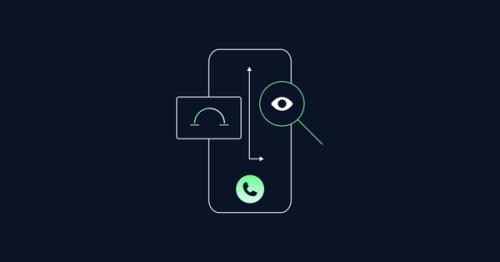
When information is conveyed through Motion Link to this headline
Consider a simple loading animation that transforms from a spinning circle to a checkmark. For sighted users, this motion sequence communicates a clear narrative: "processing → complete → success."
But what happens when that same interaction needs to work for someone using a screen reader, or someone who has motion disabled due to high motion sensitivity?
Information Hidden from Assistive Technology Link to this headline
This is exactly the challenge I encountered while creating an interactive Rive animation for my thesis research. Rive animations are powerful for creating engaging, responsive interfaces, however animation canvas, with all interactions and animated feedback, is essentially invisible to assistive technologies.
So I took up the mantle and created an interactive site using Rive animations that can be navigated by keyboard. Here are some key lessons for assistive tech accessibility in animations
Screen Readers are software programs that allow blind and low vision users to read text that is displayed on the computer screen with a speech synthesizer (text-to-speech) or braille display.
How to make Information Accessible Through Code
Link to this headline
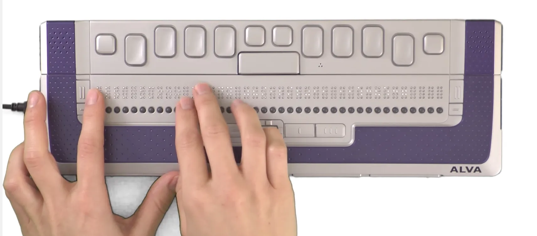
Screen Readers are software programs that allow blind and low vision users to read text that is displayed on the computer screen with a speech synthesizer (text-to-speech) or braille display.
- To start, use semantic HTML structure that screen readers can navigate. Make use of arial labels that are
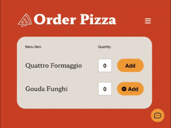
- If motion removes or adds new information to the screen, like pop ups, error messages and quick announcements, add dynamic Aria Labels that announce changes happening on screen.
- Keep purely decorative elements hidden from screen readers using
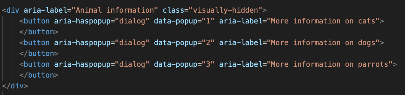
aria-hidden="true". For example animations that are purely for fun can be hidden from the screen reader. Same for buttons with icons that already have a name. - If information is not accessible create alternative solutions for screen readers. In my case, in the Rive animation some pop ups can only be discovered through hovering and clicking by mouse. I created additional buttons that are visually hidden from regular users and can be accessed by keyboard navigation. Here, make use of aria-labels that explains that the button opens a pop up (
aria-haspopup) and what content it will show (aria-label=”More information on cats”).
Because Rive animations lack built‑in accessibility features, I added hidden buttons on the right side that screen readers can detect. Each button opens a pop‑up.
The more we implement the better it will get for everyone Link to this headline
Ever since I got in touch with accessibility, I learned that we take good web design for granted. While it's easy to pinpoint what goes wrong on a website, we tend to overlook the hidden and thoughtful design choices that make a design solid and outstanding—like providing alternative solutions for those who cannot access motion as easily or subtle animations that nudge and guide the user in the right direction.
But providing motion accessibility doesn't mean we're only accommodating disabilities. The reality is that accessibility exists on a spectrum, and our needs can shift at any moment. A user might enjoy parallax scrolling on their desktop but feel nauseous trying to navigate it on their phone during a bumpy commute. Someone recovering from a concussion might need motion-free browsing for weeks, then gradually return to enjoying subtle animations.
Fundamentally motion accessibility is about choice and control, and allowing people to explore your page on their own terms. When we create motion that's predictable, controllable, and inclusive, we're not limiting the experience. We're expanding it to work across the full spectrum of human needs and circumstances.

'/%3e%3cpath%20d='M62.0348%20162.889L123.416%20162.889'%20stroke='white'%20stroke-width='4.76'%20stroke-linecap='round'%20stroke-linejoin='round'/%3e%3cpath%20d='M62.0348%20170.889L123.416%20170.889'%20stroke='white'%20stroke-width='4.76'%20stroke-linecap='round'%20stroke-linejoin='round'/%3e%3cpath%20d='M62.0348%20178.889L123.416%20178.889'%20stroke='white'%20stroke-width='4.76'%20stroke-linecap='round'%20stroke-linejoin='round'/%3e%3cdefs%3e%3clinearGradient%20id='paint0_linear_3690_24257'%20x1='93.4124'%20y1='10'%20x2='93.4124'%20y2='156.912'%20gradientUnits='userSpaceOnUse'%3e%3cstop%20stop-color='%2369FD90'/%3e%3cstop%20offset='1'%20stop-color='%23DFFAED'/%3e%3c/linearGradient%3e%3c/defs%3e%3c/svg%3e)
'%3e%3ccircle%20cx='93.2117'%20cy='93.2115'%20r='79.373'%20fill='white'/%3e%3ccircle%20cx='92.9737'%20cy='93.2115'%20r='60.571'%20fill='%230B1329'/%3e%3cmask%20id='path-3-inside-1_3690_24255'%20fill='white'%3e%3cpath%20d='M93.2117%20172.584C73.9198%20172.584%2055.2883%20165.558%2040.8004%20152.82C26.3125%20140.081%2016.9599%20122.502%2014.4913%20103.368C12.0226%2084.2351%2016.6068%2064.8577%2027.3869%2048.8588C38.1669%2032.8598%2054.4049%2021.3347%2073.0649%2016.4379L77.9002%2034.8636C63.7185%2038.5851%2051.3777%2047.3442%2043.1848%2059.5034C34.992%2071.6626%2031.508%2086.3895%2033.3842%20100.931C35.2603%20115.472%2042.3683%20128.832%2053.3791%20138.514C64.39%20148.195%2078.5499%20153.535%2093.2117%20153.535L93.2117%20172.584Z'/%3e%3c/mask%3e%3cpath%20d='M93.2117%20172.584C73.9198%20172.584%2055.2883%20165.558%2040.8004%20152.82C26.3125%20140.081%2016.9599%20122.502%2014.4913%20103.368C12.0226%2084.2351%2016.6068%2064.8577%2027.3869%2048.8588C38.1669%2032.8598%2054.4049%2021.3347%2073.0649%2016.4379L77.9002%2034.8636C63.7185%2038.5851%2051.3777%2047.3442%2043.1848%2059.5034C34.992%2071.6626%2031.508%2086.3895%2033.3842%20100.931C35.2603%20115.472%2042.3683%20128.832%2053.3791%20138.514C64.39%20148.195%2078.5499%20153.535%2093.2117%20153.535L93.2117%20172.584Z'%20fill='%230B1329'%20stroke='white'%20stroke-width='9.52'%20mask='url(%23path-3-inside-1_3690_24255)'/%3e%3cmask%20id='path-4-inside-2_3690_24255'%20fill='white'%3e%3cpath%20d='M72.6684%2016.5432C83.5818%2013.619%2094.9937%2013.0584%20106.141%2014.8988C117.289%2016.7393%20127.915%2020.9384%20137.309%2027.2154C146.703%2033.4925%20154.649%2041.7027%20160.615%2051.2973C166.582%2060.8919%20170.431%2071.6497%20171.906%2082.8514C173.38%2094.0531%20172.447%20105.441%20169.167%20116.252C165.887%20127.064%20160.337%20137.051%20152.887%20145.546C145.438%20154.04%20136.261%20160.847%20125.969%20165.51C115.678%20170.173%20104.51%20172.585%2093.2117%20172.585L93.2117%20153.535C101.798%20153.535%20110.286%20151.702%20118.108%20148.158C125.929%20144.614%20132.904%20139.442%20138.565%20132.986C144.227%20126.53%20148.445%20118.94%20150.938%20110.723C153.43%20102.506%20154.14%2093.8512%20153.019%2085.3379C151.898%2076.8246%20148.973%2068.6487%20144.439%2061.3568C139.904%2054.0649%20133.865%2047.8251%20126.726%2043.0545C119.586%2038.284%20111.51%2035.0926%20103.038%2033.6939C94.566%2032.2952%2085.893%2032.7213%2077.5988%2034.9437L72.6684%2016.5432Z'/%3e%3c/mask%3e%3cpath%20d='M72.6684%2016.5432C83.5818%2013.619%2094.9937%2013.0584%20106.141%2014.8988C117.289%2016.7393%20127.915%2020.9384%20137.309%2027.2154C146.703%2033.4925%20154.649%2041.7027%20160.615%2051.2973C166.582%2060.8919%20170.431%2071.6497%20171.906%2082.8514C173.38%2094.0531%20172.447%20105.441%20169.167%20116.252C165.887%20127.064%20160.337%20137.051%20152.887%20145.546C145.438%20154.04%20136.261%20160.847%20125.969%20165.51C115.678%20170.173%20104.51%20172.585%2093.2117%20172.585L93.2117%20153.535C101.798%20153.535%20110.286%20151.702%20118.108%20148.158C125.929%20144.614%20132.904%20139.442%20138.565%20132.986C144.227%20126.53%20148.445%20118.94%20150.938%20110.723C153.43%20102.506%20154.14%2093.8512%20153.019%2085.3379C151.898%2076.8246%20148.973%2068.6487%20144.439%2061.3568C139.904%2054.0649%20133.865%2047.8251%20126.726%2043.0545C119.586%2038.284%20111.51%2035.0926%20103.038%2033.6939C94.566%2032.2952%2085.893%2032.7213%2077.5988%2034.9437L72.6684%2016.5432Z'%20fill='white'%20stroke='white'%20stroke-width='3.332'%20mask='url(%23path-4-inside-2_3690_24255)'/%3e%3cpath%20d='M93.6151%20114.251C99.6127%20114.251%20103.326%20111.466%20105.753%20107.039L108.966%20109.181C105.825%20114.893%20101.469%20118.106%2093.6151%20118.106C84.0475%20118.106%2077.4073%20111.609%2075.6223%2099.3281H71.2669V96.1151H75.2653C75.1939%2094.9013%2075.1225%2093.6875%2075.1225%2092.4023C75.1225%2091.1171%2075.1939%2089.9033%2075.2653%2088.6895H71.2669V85.4765H75.6223C77.3359%2073.1957%2084.0475%2066.6983%2093.6151%2066.6983C101.184%2066.6983%20105.825%2069.9827%20108.966%2075.4805L105.682%2077.6939C103.326%2073.4813%2099.3271%2070.5539%2093.6151%2070.5539C86.3323%2070.5539%2081.1201%2075.4805%2079.7635%2085.4765H97.3993L96.6853%2088.6895H79.4779C79.4065%2089.4749%2079.4065%2090.2603%2079.4065%2091.1171V93.6875C79.4065%2094.5443%2079.4065%2095.3297%2079.4779%2096.1151H95.0431L94.3291%2099.3281H79.7635C81.1201%20109.253%2086.3323%20114.251%2093.6151%20114.251Z'%20fill='white'/%3e%3c/g%3e%3cdefs%3e%3cclipPath%20id='clip0_3690_24255'%3e%3crect%20width='185'%20height='185'%20fill='white'/%3e%3c/clipPath%3e%3c/defs%3e%3c/svg%3e)

'/%3e%3cpath%20d='M93.0126%2099.9539C96.8448%2099.9539%2099.9515%2096.8472%2099.9515%2093.015C99.9515%2089.1827%2096.8448%2086.076%2093.0126%2086.076C89.1803%2086.076%2086.0737%2089.1827%2086.0737%2093.015C86.0737%2096.8472%2089.1803%2099.9539%2093.0126%2099.9539Z'%20fill='%230B1329'/%3e%3cpath%20d='M59.0911%2099.9539C62.9234%2099.9539%2066.03%2096.8472%2066.03%2093.015C66.03%2089.1827%2062.9234%2086.076%2059.0911%2086.076C55.2589%2086.076%2052.1522%2089.1827%2052.1522%2093.015C52.1522%2096.8472%2055.2589%2099.9539%2059.0911%2099.9539Z'%20fill='%230B1329'/%3e%3cpath%20d='M126.939%2099.9539C130.771%2099.9539%20133.878%2096.8472%20133.878%2093.015C133.878%2089.1827%20130.771%2086.076%20126.939%2086.076C123.107%2086.076%20120%2089.1827%20120%2093.015C120%2096.8472%20123.107%2099.9539%20126.939%2099.9539Z'%20fill='%230B1329'/%3e%3cdefs%3e%3clinearGradient%20id='paint0_linear_3690_24254'%20x1='93.018'%20y1='19'%20x2='93.018'%20y2='167.03'%20gradientUnits='userSpaceOnUse'%3e%3cstop%20stop-color='%2369FD90'/%3e%3cstop%20offset='1'%20stop-color='%23DFFAED'/%3e%3c/linearGradient%3e%3c/defs%3e%3c/svg%3e)