Long before wireframes and design systems, humans were already solving problems with empathy, intention, and structure. This newsletter uncovers the often-overlooked roots of UX research. It’s a space to explore how communities have always listened, adapted, and designed with intent and how those stories can guide the way we research today.
Because UX research isn’t a new invention. It’s an old instinct.
User Experience isn’t new; we’ve simply digitized what humans have always done with stone, scrolls, rituals, and cities. From the acoustics of Roman amphitheaters to the structure of ancient manuscripts, the principles of user-centered design have been around for centuries. At its core, UX is about creating something made for people—something intuitive, tailored to the needs of the users, and aligned with human principles. Let’s discuss another example close to home.
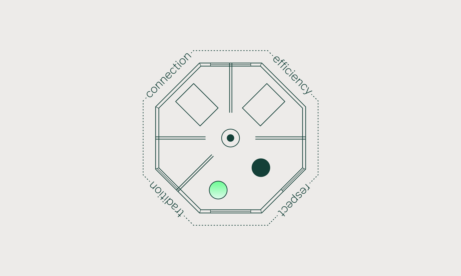
In Southern Africa, one of the most iconic architectural designs found in rural villages is the roundavel. This traditional circular-shaped hut, which has evolved to be built with bricks and cement in modern times, has stood the test of time. Its design, centuries old, embodies the essence of user-centered design and, in my lived experience, represents the epitome of human-centered design.
The round shape of the structure is inherently aligned with human needs. The roundavel serves as a central gathering space for family and community activities, and its curved design promotes effortless movement and interaction, ensuring no one feels isolated. In a roundavel, you can easily see and engage with everyone in the room, creating a welcoming environment for all.

In Zulu culture, it is considered rude to show your back to others. The rondavel cleverly addresses this cultural norm by minimizing the behavior. In a circular space, your back naturally faces the wall behind you, while you maintain a full view of the space, ensuring no one is turned away or excluded. This thoughtful design choice not only maximizes natural flow but also enhances communication among the occupants. In essence, the roundavel is a perfect example of how thoughtful design can foster human connection, cultural respect, and functional efficiency. It’s a living testament to the principles of user-centered design, long before the term was even coined.
As we explore these age-old principles of design, let's dive into the modern world of UX research and how the same foundations of human-centered design shape our digital experiences today.
UX Research Demystified Link to this headline
In order to arrive at understandings about the end user research it is necessary to dig around and uncover information about their problem, current solution and wants in the future. It helps us move from guessing to knowing, from assuming to understanding. Whether it’s through quick interviews, observing behavior, or digging into feedback, research gives us real-world insight into what works and what doesn’t. UX research brings clarity to chaos. It aligns teams, grounds ideas in evidence, and reminds us that behind every click, scroll, or tap is a human being trying to get something done. It’s not just for big teams or big budgets—anyone can start small and grow from there.
To put it simply, UX Research is the uncovering of your customers needs and possible solutions to catering to those needs.

Myth 1: UX Research Is Only for Experts with Big Budgets Link to this headline
Many believe that effective UX research requires specialized expertise and substantial funding. However, even small teams can conduct meaningful research using simple methods like user interviews or usability testing. The key is to start. You know who your customer is: go speak to them and ask a couple questions. You’ll be surprised what you learn!

Myth 2: UX Research Is Just Asking Users What They Want Link to this headline
While user input is valuable, relying solely on direct questions can be misleading. Users may not always articulate their needs accurately. That is why there are methods that focus on asking questions - which assess users attitudes. And there are methods that observe what users do - this assesses their attitudes.

Myth 3: UX Research Is Time-Consuming and Delays Projects Link to this headline
Some teams avoid UX research fearing it will slow down development. In reality, integrating lean research methods early can streamline the design process, prevent costly revisions, and lead to more user-centered products. UX Research can slash project development times in half AND leave you with a successful launch According to Robert Pressman, Software Engineering: A Practitioner’s Approach, Fixing a problem in development costs 10 times as much as fixing it in design, and 100 times as much if it's found after release."

Myth 4: UX Research Is Only for Digital Products Link to this headline
UX research is not only limited to digital interfaces, it’s just as powerful when applied to physical products, services, or even internal processes. While the term user comes from the digital world, the principles behind UX research are rooted in understanding people’s needs and behaviors. Whether we call them users or customers, the goal is the same: to create better experiences. Taking a holistic view of these experiences can unlock improvements across all touchpoints, digital or not.

Myth 5: UX Research Is a One-Time Activity Link to this headline
Conducting UX research only at the beginning of a project overlooks the evolving nature of user needs. Continuous research ensures that products remain relevant and responsive to user feedback over time. By integrating research into product dev same as design and coding, you’ll keep the outstanding feeling of building relevant solutions
The Art & Science of Usability Testing Link to this headline
When (and When Not) to Test Link to this headline
Usability testing isn’t a one-off checkbox. It’s your best friend throughout the design process. Use it early to catch red flags in your wireframes, in the middle to refine flows, and late to sanity-check your almost-final product. Basically: if users are touching it, you can test it.
That said test: Early. Midway. Right before launch. After launch. Basically, anytime you want to make sure you're not flying blind. Usability testing shines when you’ve got something tangible to put in front of users—a sketch, prototype, or live feature—and you need feedback to refine it, validate assumptions, or uncover blind spots.
It's perfect for:
- Spotting friction in key flows (think onboarding, checkout, or search).
- Comparing two design directions.
- Confirming that what you’ve built actually makes sense to someone who isn’t... you.
When Not to Test: Link to this headline
Don’t test when you don’t have anything to show. Seems obvious, but you'd be surprised. If you’re still swimming in abstract ideas or solving a big, fuzzy problem, you’ll get more value from exploratory or generative research like user interviews or journey mapping.
Also, skip usability testing when:
- You’re looking for long-term behavioral patterns (that’s diary study territory).
- You’re just chasing validation (testing isn’t a formality—it’s about learning).
- You can’t act on feedback. Testing without the room or willingness to improve the product is just... academic.
Remember: testing helps you learn—but only if you're ready to listen.
💡 Pro tip: Want more honest feedback? Let your testers know they’re not the ones being tested, the design is. People naturally avoid giving negative feedback because they don’t want to hurt your feelings or look “bad.” Start each session by saying something like:
This isn’t a test of you. We’re testing the design, and we know it’s not perfect. Your honest feedback helps us improve it.
This simple shift makes participants feel safe, which means you'll get way more real, unfiltered insights—the good stuff.
Read more about common pitfalls in Usability Testing here.
A Little Help from Dinghy Link to this headline
To support your usability testing endeavors, we've prepared a handy freebie: a Usability Testing Checklist. It's designed to guide you through planning, conducting, and analyzing your tests effectively.
Personas: Beyond the Basics Link to this headline
Dinghy is Anti-Persona 😡
Why you might ask, because they suck!
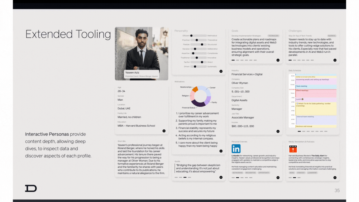
Traditional personas are fun to look at (the first time), but not always practical. Too often, they end up gathering dust on a shelf, forgotten after the initial rush of excitement fades. Why? Because they’re static, rigid, and can sometimes feel like just another checkbox to tick in the project plan. We’ve all been there – you create a persona, it gets stored away, and the insights just don’t have the staying power you hoped for.
But what if there was a way to breathe life into your personas and keep them relevant long after the project is over? Enter interactive personas. These are the ones that get your team talking, debating, and truly using the insights in real time. No more collecting dust – these personas evolve, adapt, and speak directly to your decision-making process. Imagine having a persona that’s not just a static document, but a living, breathing part of your workflow that is used as a central tool for the whole team.

Research Methods Link to this headline
Surveys Link to this headline
Quantitative
Surveys are your go-to for collecting broad, quantitative data. Need to know how many users are frustrated with your checkout process or which feature they use the most? Surveys are quick, easy to distribute, and can provide a lot of insight in a short amount of time. Just be careful to ask the right questions.
When to use: When you need to gather data from a large group and need clear, actionable insights fast.
Tools: Typeform.com
Interviews Link to this headline
Qualitative
Interviews are perfect when you want to dive deep into your users’ thoughts, feelings, and motivations. Interviews provide qualitative insights that surveys just can’t touch. You’ll uncover pain points, emotional responses, and those little gems of insight that might otherwise stay hidden.
When to use: When you need to understand the why behind user behavior or uncover nuanced needs and pain points.
Protip: Make sure to ask open ended questions that encourage elaboration and insight
Usability Testing Link to this headline
Qualitative & Quantitative
Ever had an idea that sounded great in theory but completely flopped in real life? Usability testing is like putting your product through a rigorous reality check. You watch real users interact with your design and see where they get confused, and where things just click. It’s not about asking for feedback; it’s about observing action in its purest form.
When to use: When you want to test how well your design works in practice, identify usability issues, and refine interactions before launch.
How to use: invite your participant to a screenshare of your design/prototype/digital napkins drawing for 30 mins max and be amazed by the insights!
Card Sorting Link to this headline
Quantitative
Card sorting is like a game of organizing your design elements into neat, understandable categories. You’ll present users with a list of topics, features or content and they’ll sort them into groups that make sense to them. It helps identify how users expect to find information and can dramatically influence your site or app’s information architecture.
When to use: When you need to organize content or features in a way that makes sense to your users and aligns with their mental models.
Tools: https://www.uxtweak.com
Ethnographic Research Link to this headline
Qualitative
Ethnographic research is all about immersing yourself in your users’ world to truly understand their context.Instead of relying on interviews or surveys alone, this method involves observing people in their natural environments at home, at work or wherever they interact with your product or service. By seeing firsthand how they behave, adapt and solve problems, you uncover rich, real-world insights that are often missed in more traditional research approaches.
When to use: When you want to understand users in their natural habitat and uncover insights that might not come through in controlled testing.
Heatmaps Link to this headline
Quantitative
Heatmaps allows you to have x-ray vision into your users’ actions. These tools show you where users are clicking, scrolling, and paying the most attention on a page. They help you see the hot zones and cold zones of your design, giving you valuable insight into user behavior at a glance. Want to know if your CTA button is getting ignored? Heatmaps have you covered.
When to use: When you want to visually understand how users are interacting with specific pages or design elements.
Tool: Hotjar.com
AI & UX Research: Friend or Foe? Link to this headline
I believe AI will usher in a golden age of research. As data becomes central to every decision, companies that invest in rigorous, targeted, primary research will have a real competitive edge. In the past, doing research well was expensive, too expensive for many teams. That meant fewer companies invested in it, and stakeholders couldn’t always tell the difference between quick, mediocre insights and high-quality ones. So they often didn’t want to spend the time or money.
Now, AI is changing that. It’s speeding up the slowest parts things like documenting findings, linking evidence, pulling out the right quotes or video clips, even experimenting with AI-driven interviews in place of traditional surveys. That means good research won’t just be faster it’ll become more accessible, more scalable and more respected. And maybe, just maybe, we’ll reach a point where doing it well becomes the norm, not the exception. I also think there’s a lot of design/product research to do for AI itself
With this being said there are a few ethical questions we have to consider:
Are participants aware that AI is involved in the research process? If an AI is analyzing their voice, facial expressions, or responses, they need to know and be comfortable with it. Is this even something that you find important
I’d imagine AI doesn’t magically remove bias. The data it's trained on is biased, AI can easily amplify biases that impact negatively impact marginalized groups, as well as continuing to misrepresent or overlook entirely. We have to stay critical of what data we’re feeding into these tools and how we interpret their output.
Where is the data going? How is it stored? Who has access? If you're using third-party AI tools, you need to know what’s happening behind the curtain. User research often involves sensitive info, so protecting that is key.
Empathy, trust, body language. These are still things AI can't replicate. While AI might one day handle some forms of data collection, it shouldn't replace the rich, human layer of qualitative research.
Poll: AI Tools in UX Research Link to this headline
We’re seeing a rise in AI being used to analyse user interviews, summarising insights, tagging moments even detecting emotions.Are you aware that AI is involved in the research process?
Hot Take Link to this headline
Da Vinci was a glorified UX designer Link to this headline

The Vitruvian Man? It’s basically the first wireframe ever. Proportions? Check. Symmetry? Check. User-friendly design principles? Check. Da Vinci didn’t just want to paint. He wanted to optimize human interaction with the world, one geometrically perfect arm swing at a time.
Da Vinci was essentially mapping out how the human body would “interact” with space in the most efficient, balanced, and harmonious way. He wasn’t just thinking about how things looked—he was thinking about how things worked, just like a modern UX designer would. Every angle, every proportion, was carefully crafted to ensure that the body (or design) functioned at its absolute best. The idea was to create a seamless, intuitive relationship between the user (the human body) and the environment (the space we move through).
In UX terms, think of it as the first “wireframe” to optimize performance, with zero distractions. No logos. No buttons. No shiny icons. Just clean lines that told you exactly how everything fit together. Even the fact that it’s a drawing shows that Da Vinci wasn’t just a painter—he was a designer with a goal in mind. And that goal was, of course, maximizing human potential, much like how a UX designer would optimize an app to be as intuitive and efficient as possible.
Petra argues this case marvellously by placing da Vinci in silicon valley as a UX designer
What If Leonardo da Vinci Was a UX Designer in Silicon Valley?
